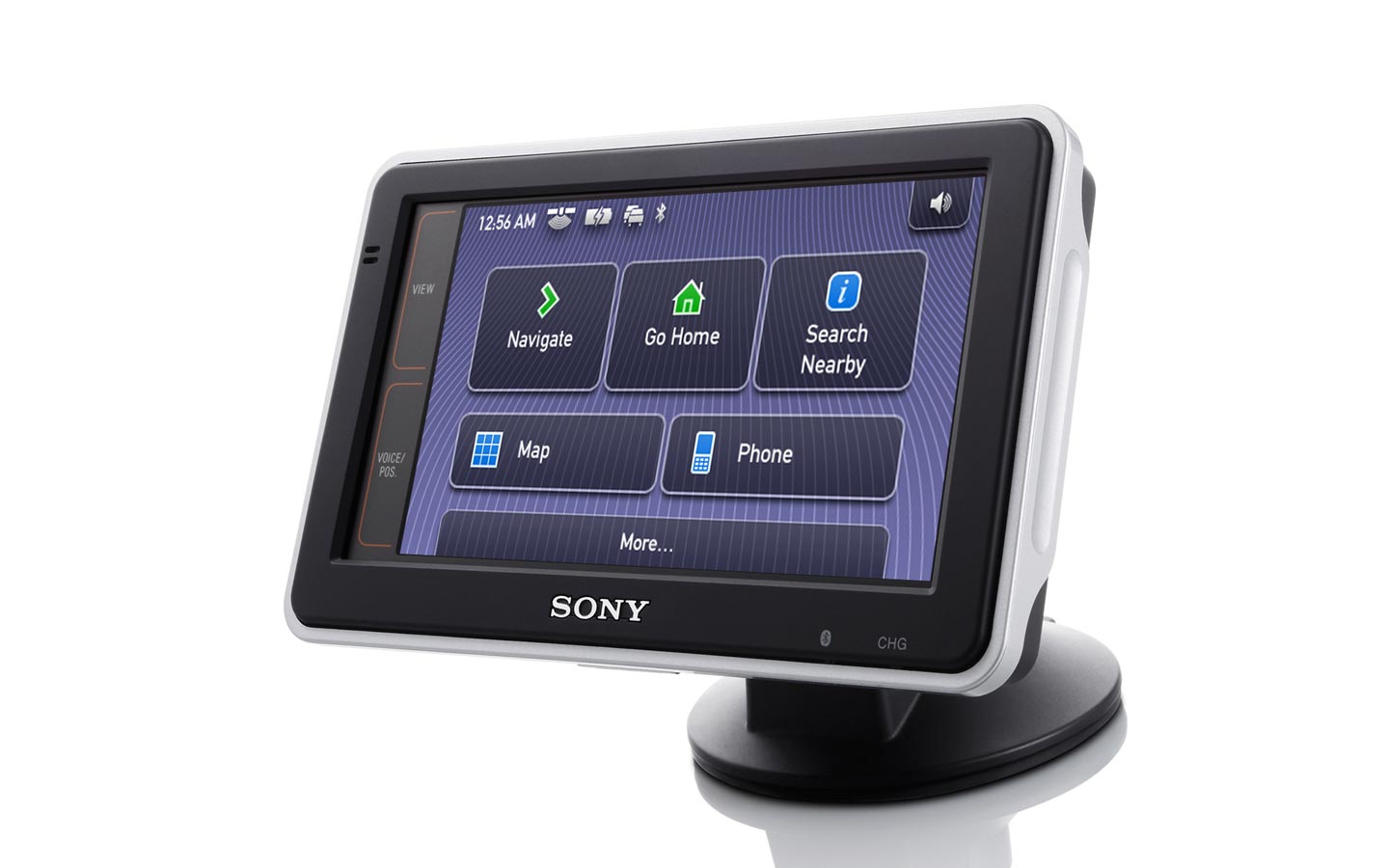
While I was employed by Sony in London, one of the long-term projects that I worked on was the design of a new series of European-focused ‘nav-u’ personal navigation devices, for launch in 2006 and 2007. I was asked to design a completely new visual user interface for these products.
My initial approach was to understand both the business context and user needs in order to address the business goals for the product. Then, I would work with engineering to understand the technical parameters within which the new design would need to be executed.
In 2006, the global market for personal navigation devices was growing rapidly and becoming very competitive amongst several brands. The smartphone revolution hadn’t occurred yet and first-party in-car navigation systems were expensive options that lagged behind standalone devices in technology and usability. Therefore, portable touchscreen devices for in-car navigation were the most popular and effective form factor.
Sony was already an established competitor in the Japanese market, and wanted to build out its product offerings for the European and North American markets. Having launched its debut product for these markets in 2005, the business wanted to significantly improve and expand its product line to encompass a range of device sizes and capabilities to better meet the needs of European consumers.
I set about researching the competitive landscape, and analysing market-leading products.
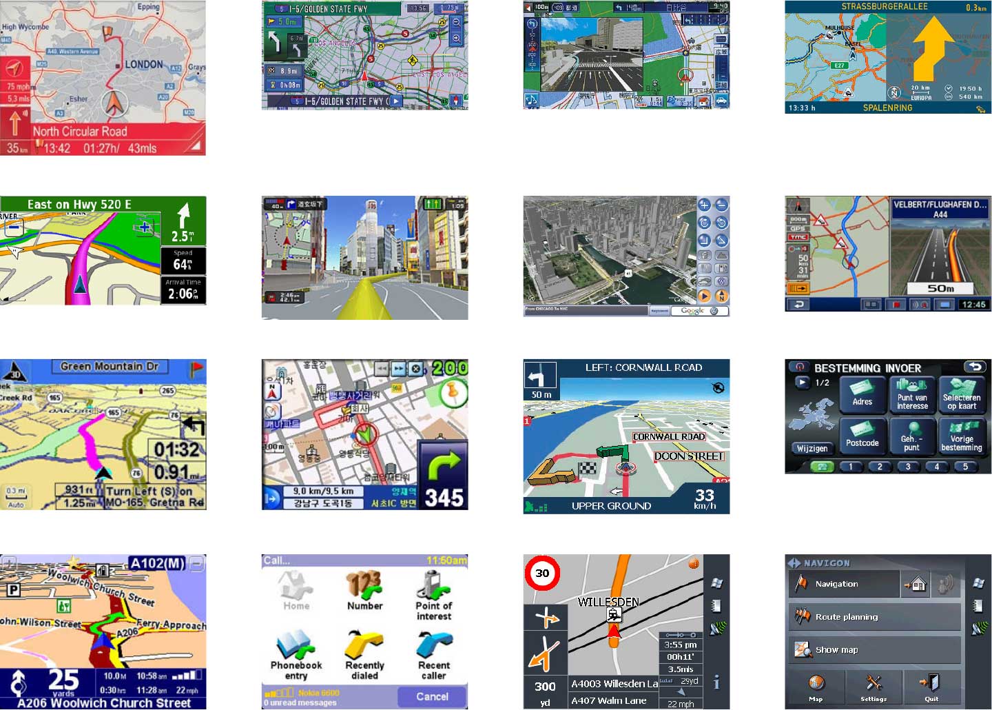
Despite the competition in the European market already, it was clear there was a great opportunity to establish a more sophisticated, refined, and usability-focused product.
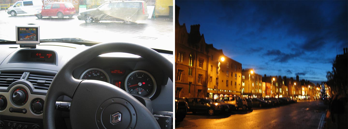
Being entirely new to this type of product myself, I had to gain first-hand experience evaluating Sony’s own product. This involved test driving in different conditions including city, small town, highway, adverse weather, day and night etc.
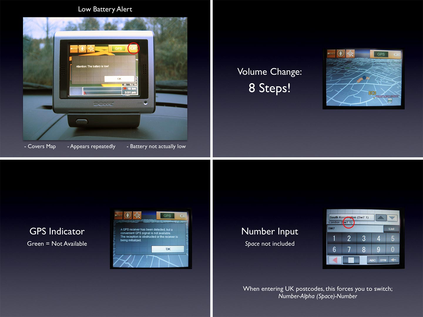
I reported my findings from test driving the first-generation product back to stakeholders in the business unit, so that we could improve upon it in the design and execution of new products.
I worked with the stakeholders to establish requirements for the new software, incorporating the feedback they had gathered on the first product. I also had to understand how the company intended to develop the software for the new devices, which was quite a challenge in itself.
The primary stakeholders of product development were at the business unit in Japan. There were additional stakeholders at the European sales company, based in England.
Although Sony developed the software for its Japanese domestic product line, due to the complexities of the European market, it opted to license software for Europe from a third-party. The application software for these devices was developed by Navigon, based in Germany. The hardware and firmware of the devices were developed in Japan.
The navigation software was based on Navigon’s own platform (which it sold as a first-party product and licensed to other companies). Most of the functionality of the software was defined and developed by Navigon, but it was specifically customised to incorporate Sony’s proprietary interface design and additional functional requirements. For instance, Bluetooth hands-free phone integration was added according to Sony’s specifications.
During the course of the project, we met with the engineering team at Navigon to understand technical parameters, establish working processes, and resolve issues with the software as it was developed.
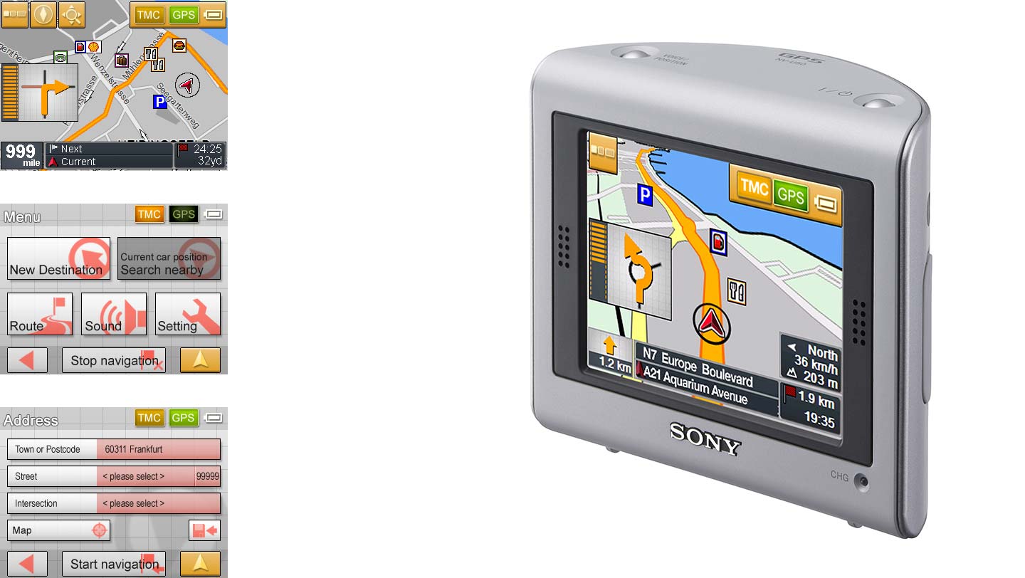
From evaluating Sony’s first-generation product, I identified several design issues to address with the new design, which included:
I set out to create a new visual design language that would communicate more effectively with users. I established principles that would apply across all of the user interface, consisting of many different screen types.
While developing the screen designs, it was important to establish minimum comfortable sizes of elements (buttons, text etc.) for the target device touchscreen sizes. I built interactive prototypes to test different element sizes, button states, and the flow of menus and screens. These prototypes ran on equivalent-sized touchscreen PC devices, before it was possible to run software on actual pre-production hardware.
The visual design language had to incorporate many different control types (menu buttons, toggle buttons, lists, single-select, multi-select etc.) and accommodate several functional screen types.
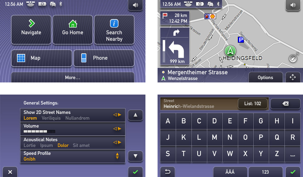
As there were a large number of screens, they needed to follow a logical structure to allow users to navigate them easily and consistently.
While I created the overall visual design language, I also directed designers at an external agency to assist with the production of rendered screens and the creation of elements such as icons. I also developed a design workflow process to deliver screens and assets for production to maximise visual integrity within the limitations of the target device platform.
The final design was delivered as hundreds of screens and elements incorporating the underlying principles to present an effective, usable interface.
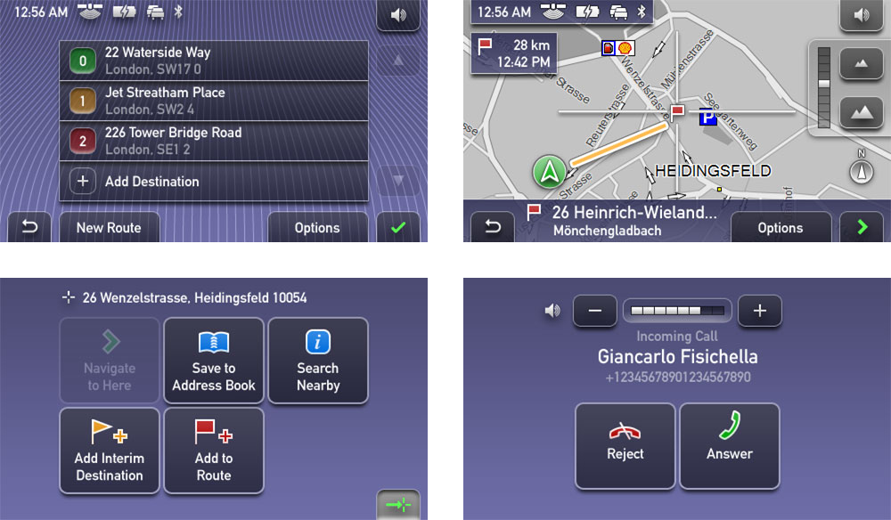
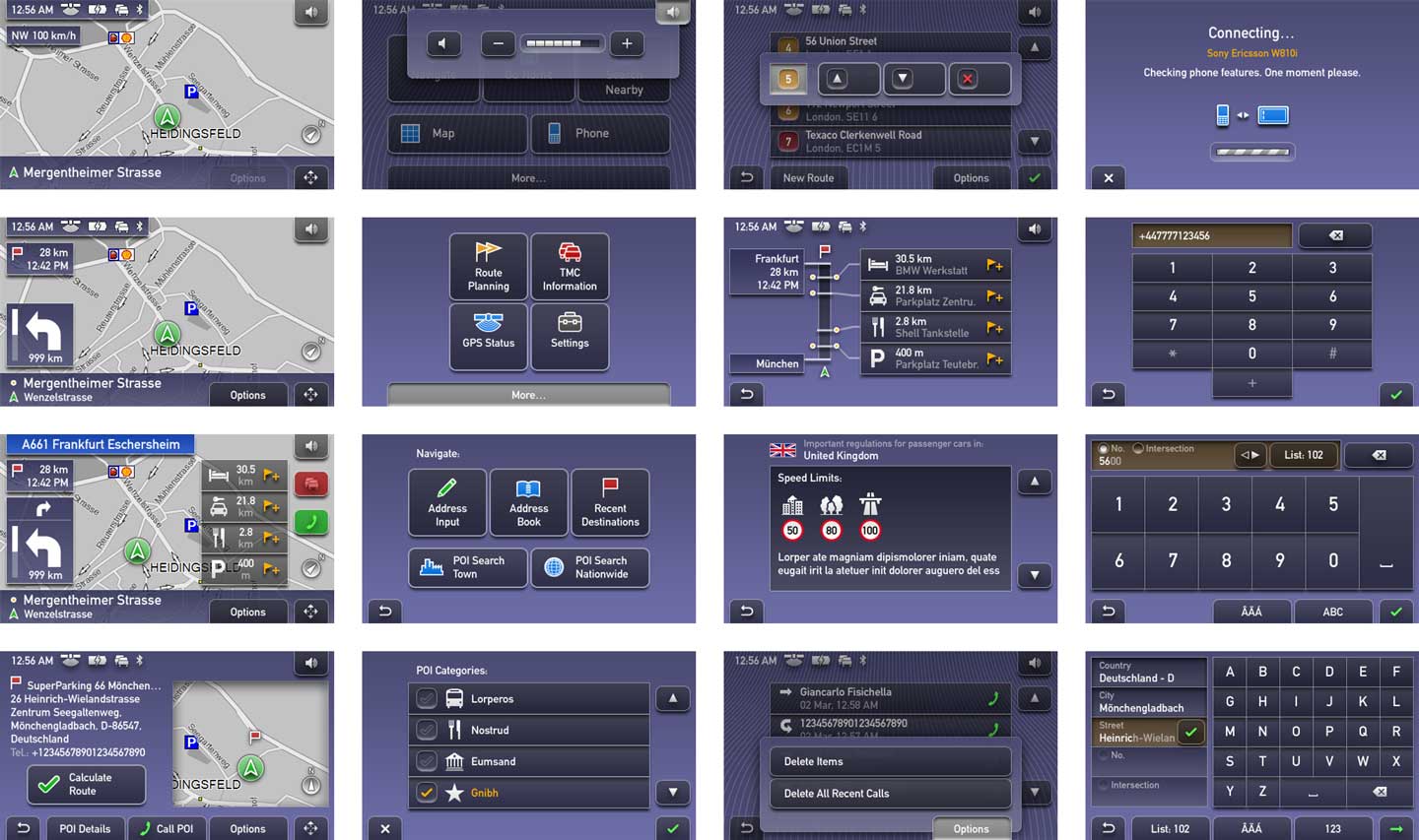
Besides the initial widescreen device, the interface design also had to be adapted to a smaller screen device.
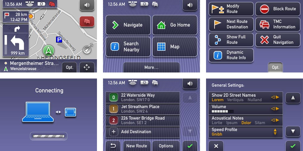
Building upon the same components as the widescreen design, I adapted key screens for the smaller display and directed the external agency to produce a full set of the small screens. As the smaller device offered much of the same functionality, it was essentially a challenge of fitting the same information in smaller screen space.
Addressing the broader user experience, it was also necessary to design an accessory desktop PC application. This was used to connect to navigation devices to install or remove regional maps. The design of this application followed the overall design language from the devices, but took into consideration differences in input methods. For instance, the desktop application was mouse-driven and supported hover states. Overall, it used many of the same components and elements from the device user interface to maintain a cohesive experience.
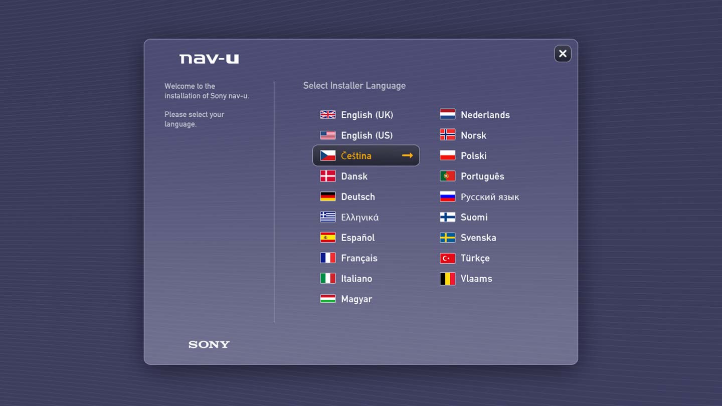
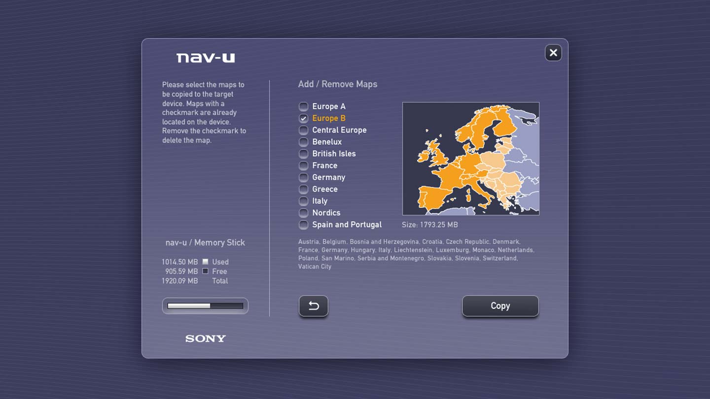
Throughout the development of the software, I worked with the engineering teams to ensure that the end product matched the design and attained a high level of quality. I tested beta software and hardware and provided feedback, including through a bug tracking system.
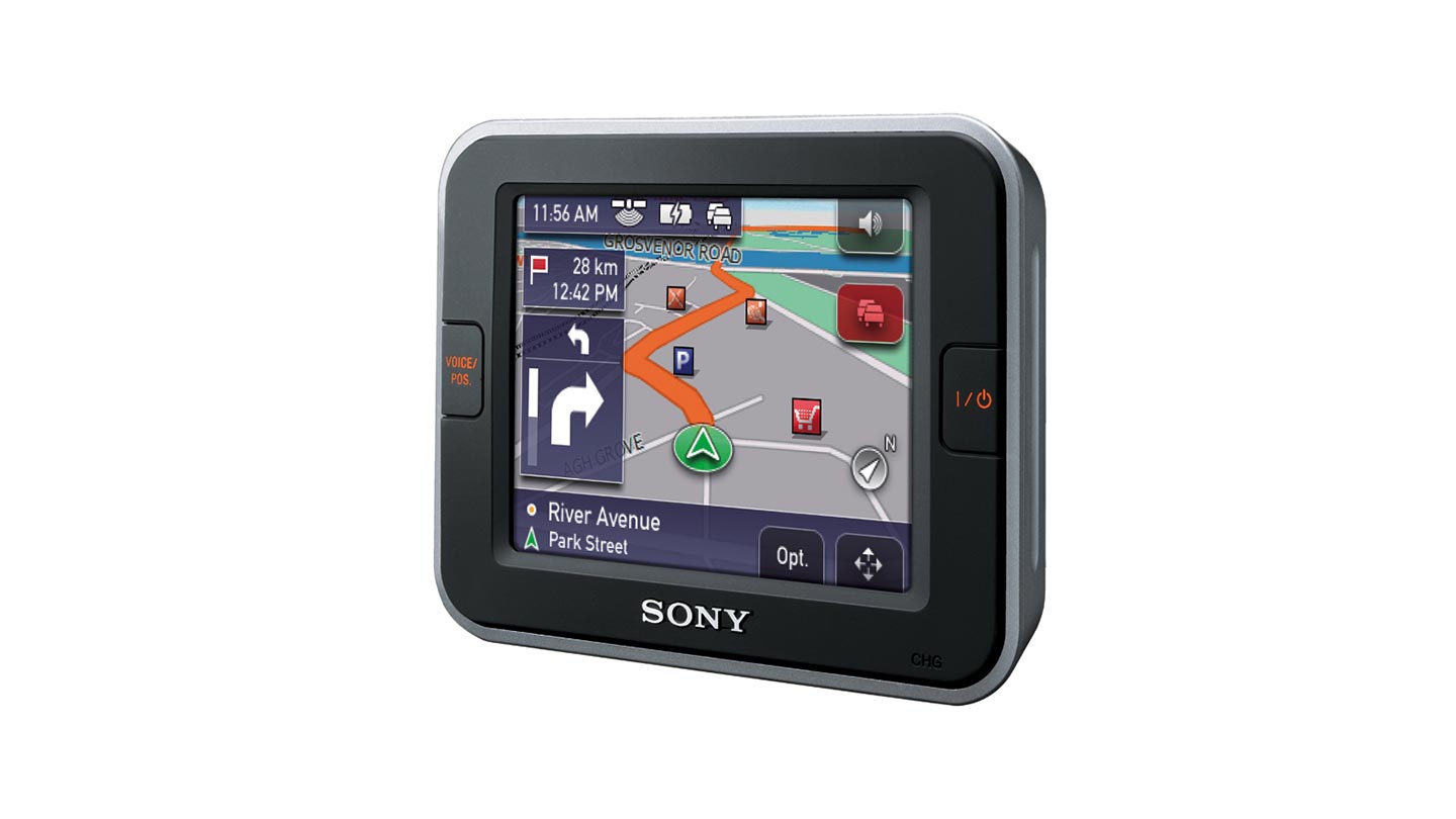
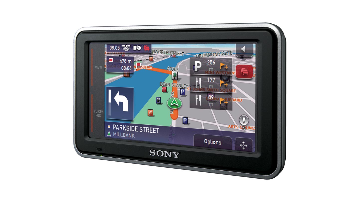
The second-generation navigation devices were completed and mass-produced with all-new hardware and software design, and released across the European market in 2006 and 2007. There were about 10 models from entry-level to high-end with a range of different features. All of them were built from the same software base using the new design language, and were well-received in the market.
While this was a very challenging project, it was one of the most satisfying for me. I was able to improve upon the predecessor product, create a design language for a new set of products from start to finish – concept to production – and see those products enjoyed by customers across Europe.