I joined a small product team of about 5 people, as the first designer. I worked directly with the product owner to understand the purpose of the existing application and the objectives for an entirely new application that would replace it. The high-level goal was to establish a new design which could be implemented and further iterated by a new product development team (yet to be formed).
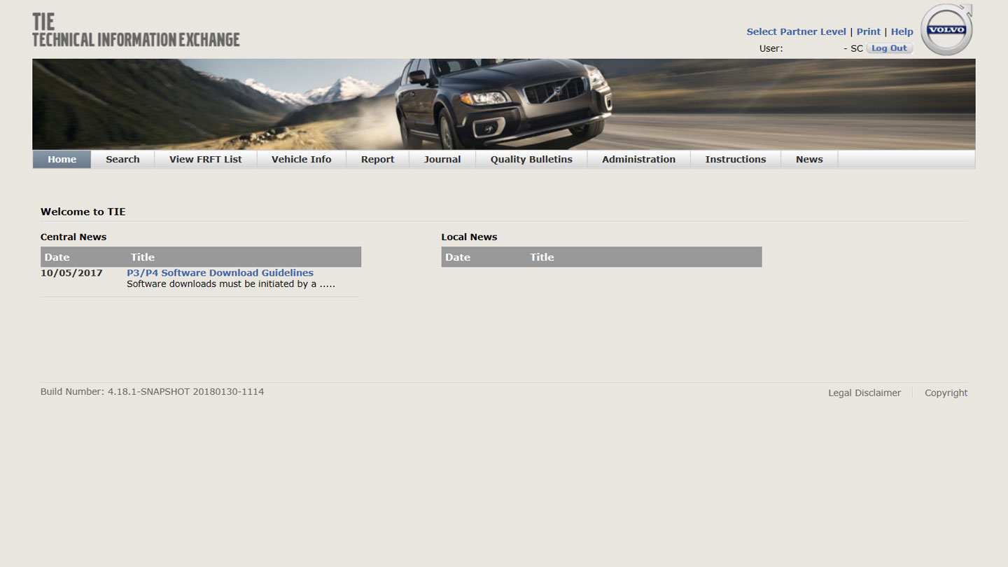
The existing web application called “Technical Information Exchange” (TIE) was initially built more than a decade earlier, without the benefit of ever being designed or well-architected.
It was a functional artefact built and used out of necessity, and suffered greatly from lack of usability, maintainability, and performance. It had accumulated such a high level of technical debt that building upon or updating the existing application wouldn’t be worth the effort. The only solution was to build an entirely new application designed for its users and processes from the start.
At a high level, the purpose of the application was to support 25,000 technicians worldwide who service Volvo cars. It provided technical information and acted as a structured communication channel between 3 distinct entities:
When Volvo customers need to have their cars repaired or routinely serviced, they would arrange this with their local workshop. Technicians in the workshop work on the car to address the issues raised by the customer. TIE was one of several applications that technicians used in the process. Although it wasn’t a primary tool that’s always used (such as VIDA), it was crucial when needed.

Over the course of several in-depth working sessions with the product owner and other stakeholders, I mapped out the functions, user flows, and underlying processes that TIE supported, and proposed ways in which these could be improved.
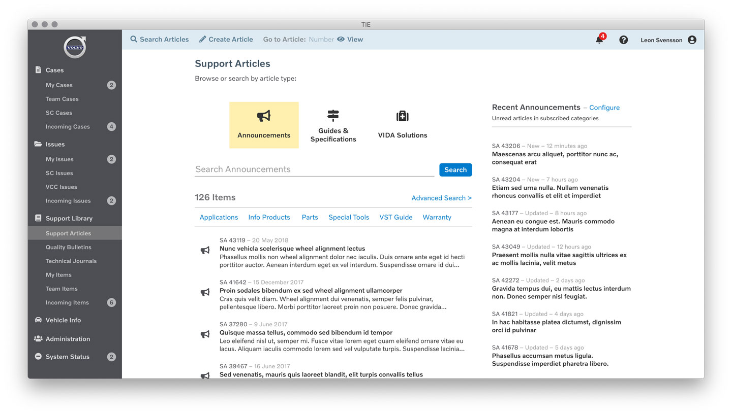
There were at least 5 major process flows based on different types of data: Reports, Quality Bulletins (QB), Technical Journals (TJ), Service Program Journals (SPJ), and News. An additional type, called an Issue was to be added to the new application. Each of these had a different purpose, whilst 3 of them had similarities in their overall format. It was important to communicate to users what each of these were for, and when they were related.


I questioned the existing structure of the application and how items should be presented within navigational and page hierarchies.
For example, the existing app displayed News on the home page (shown every time on login) but it had become a practically disused communication channel that outlived its presence. This needed to be entirely rethought based on the purpose it was trying to fulfil.
Through statistical analysis, it was possible to determine how often each area (and in some cases each function) of the existing application was actually used. This helped us to determine their relative importance.
For example, in many instances users were required to select a category and sub-category to assign to a document, or filter against when browsing or searching. These could have dozens, hundreds, or even thousands of possible categories. This imposed a huge cognitive burden upon users when prompted to choose a relevant category in order to proceed with a task. I sought to simplify by removing or combining these categories where they were never or seldom used.
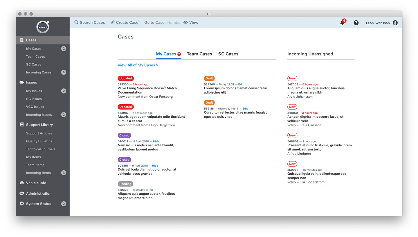
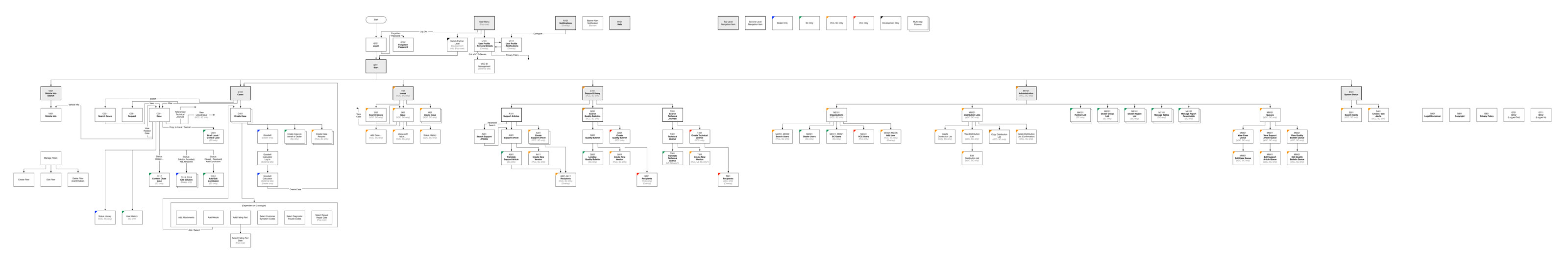
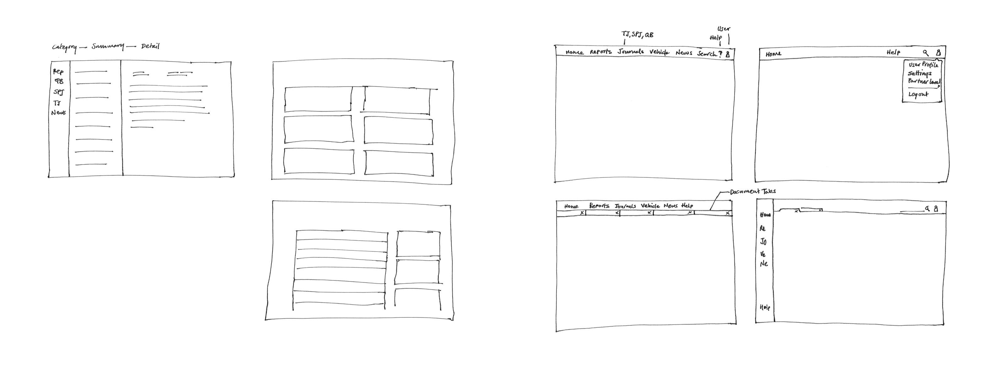
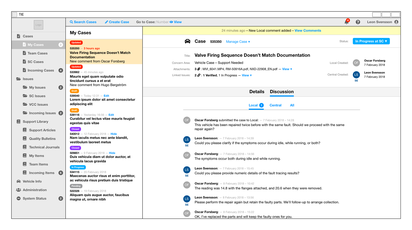
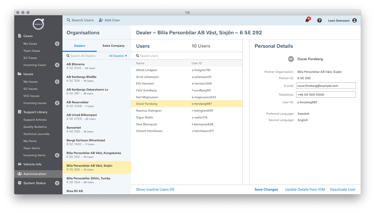
I mapped out the entire application in the form of a site map. This provided visibility into the different screen types and the navigational structure. I also mapped which user roles had access to given functionality – each screen had a colour-coded corner indicating who could access it. As the new application developed, I evolved the map with it.

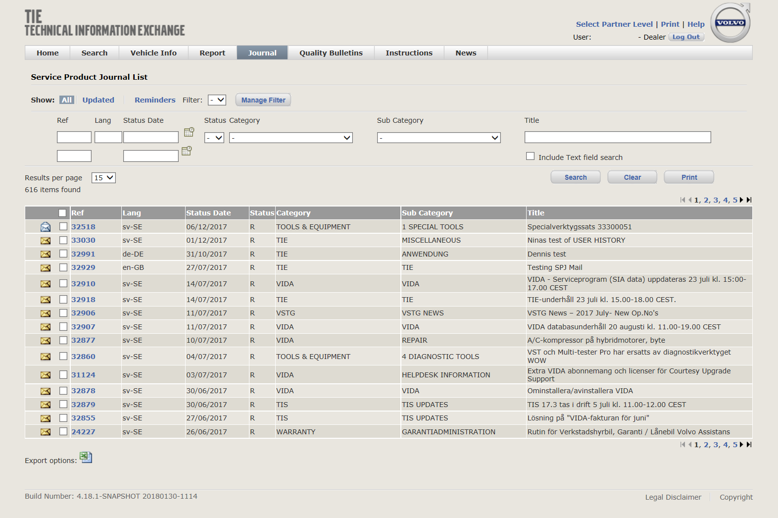
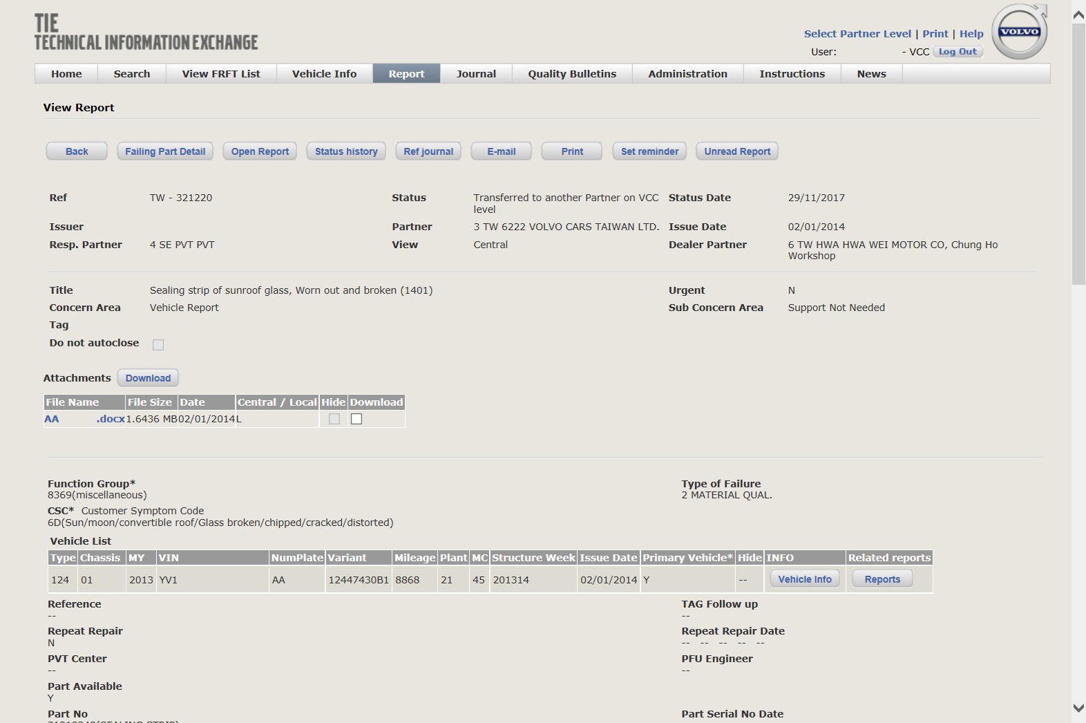
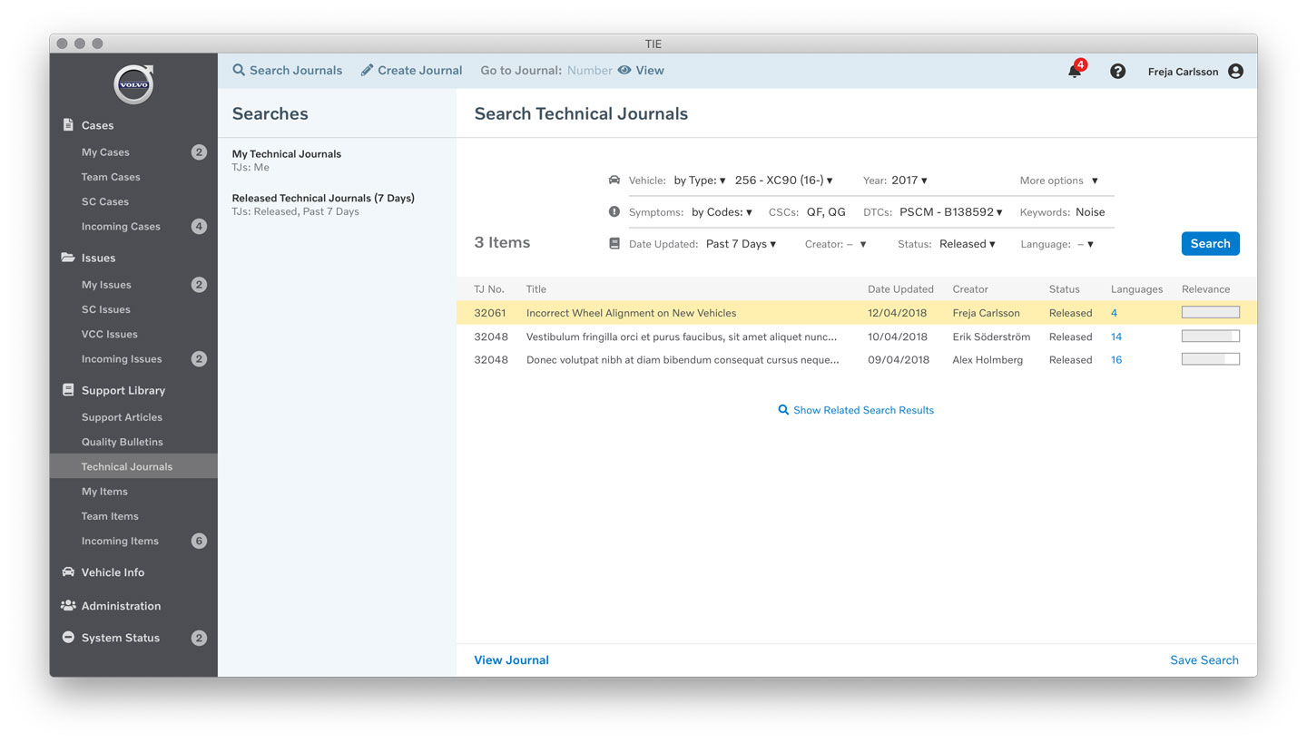
The existing application followed a hierarchy that defaulted to displaying a generic ‘all results’ (or ‘no results’) search screen for each document type. This meant that users would almost certainly need to construct a search query to find useful relevant information. The search filters provided were overly comprehensive, giving no priority to the most useful or frequently used parameters. In some cases, returning the ‘all results’ first page was very slow, and the user had to wait for this before they could even begin narrowing their search.
In many use cases, search wasn’t an appropriate model for the user. For some document types it would be more appropriate to browse by topic, to see the user’s own documents, to see items requiring follow-up attention, and so on. None of these use cases were easy to accomplish, requiring the user to construct and refine search queries on demand every time.
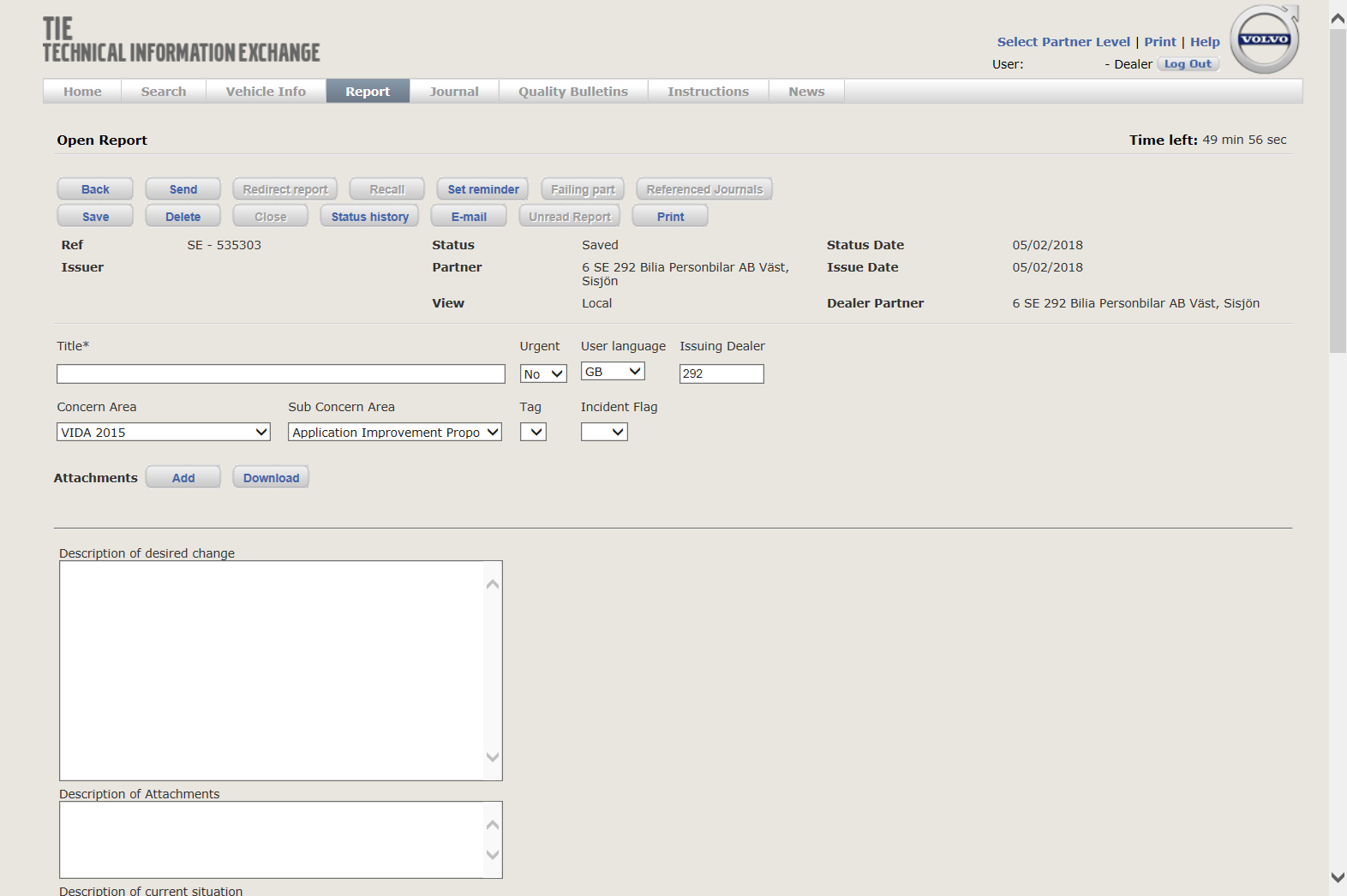
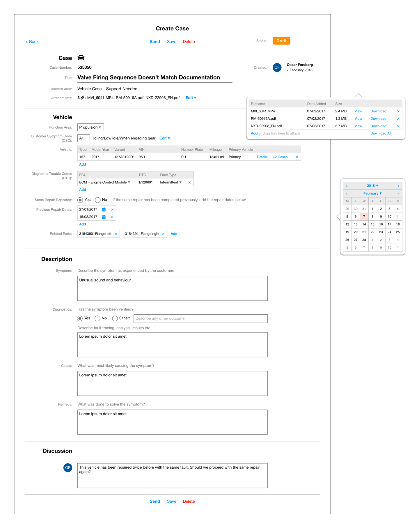
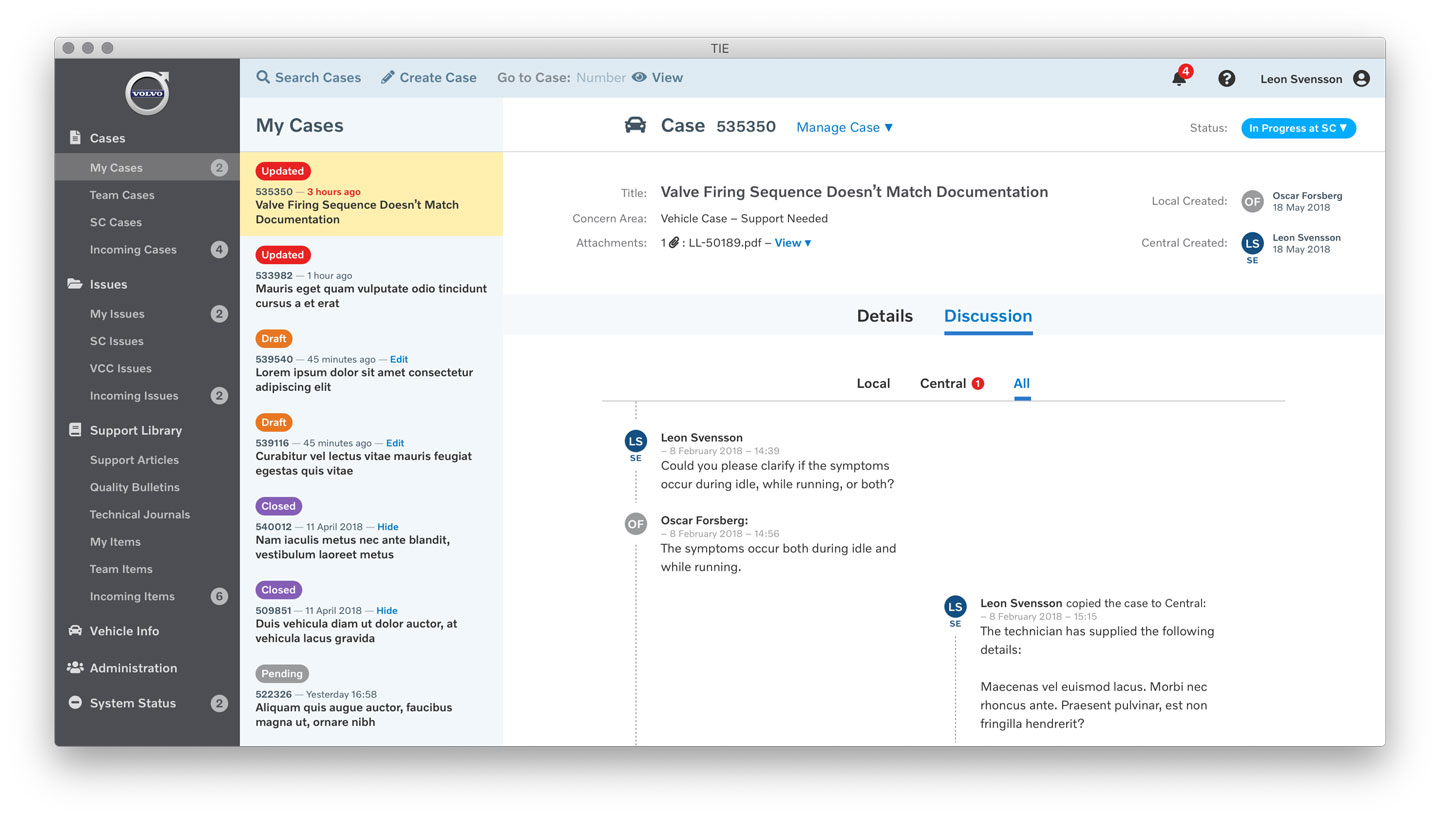
In forms, there was a lack of clear page structure, many edge-case action buttons and fields, and little consistency between pages. Discussion histories were reverse-chronologically ordered, which made reading a whole conversation in order very cumbersome.
The new design needed to prioritise the most frequently performed tasks. It had to have clear navigation and hierarchy. It had to have consistent interaction models for navigation, actions, lists, forms, multi-step processes, controls, elements, terminology, icons, and colours.
I sketched out ideas for different screen types such as landing screens, browse/search screens, and different options for handling navigation.
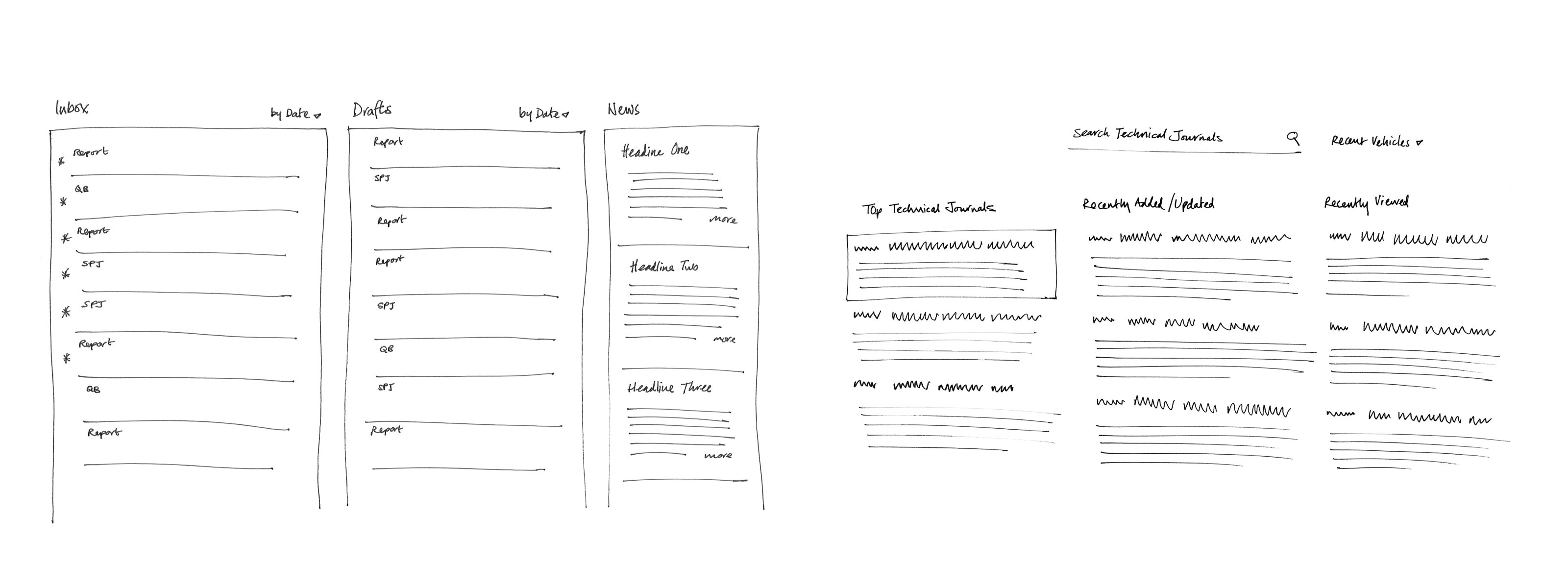
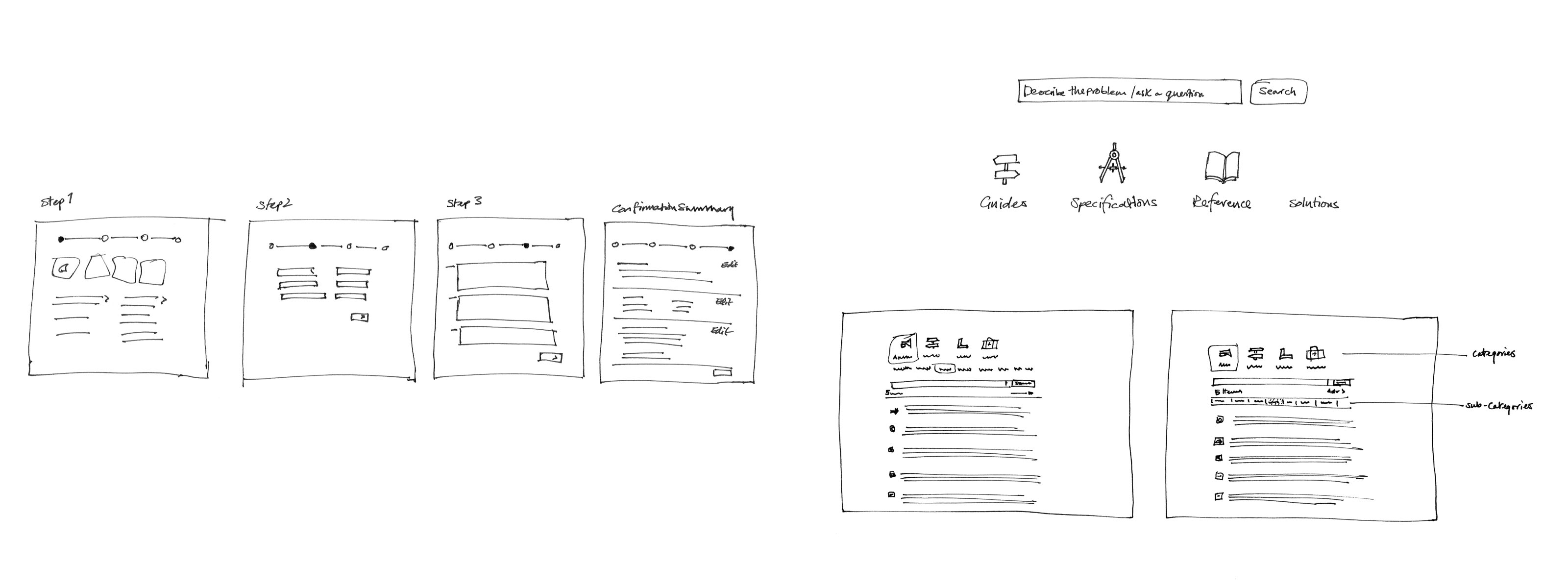
As the details within screens became more important, sketches transitioned to wireframes. These formed the primary documentation of the detailed design before applying visual design. I established and refined these over numerous iterations, while regularly consulting with the product owner and stakeholders.
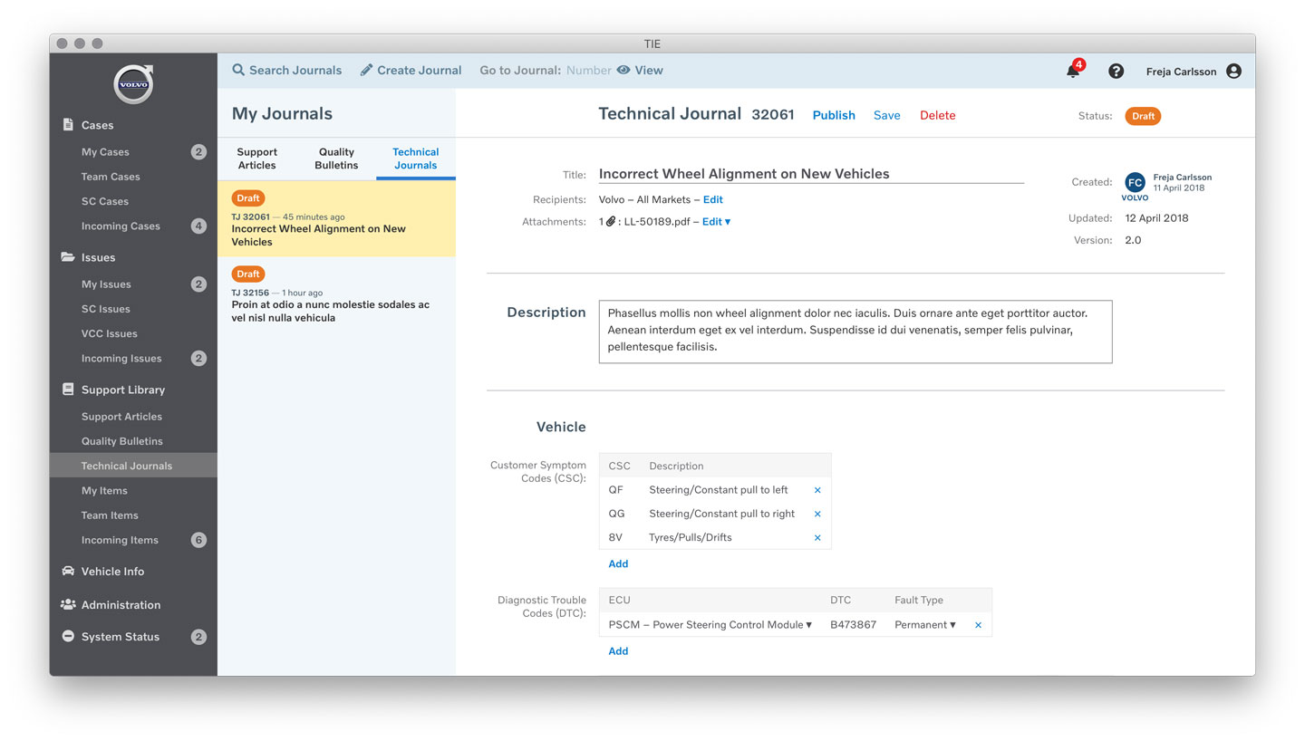
Designing key examples of screen types would serve as a representative template for other similar screens. So, rather than design 30 Case templates, I started with one fairly complex one to serve as the basis for other Case types. The developers could then implement the Case as a logical structure into which specific form elements would flow.
By far the most common Case type was the Vehicle Case. This accounted for 50% of all Cases created, and was also one of the most complex. The next 3 most common Case types accounted for a further 33%. All document types had a creation/editing mode and a read-only viewing mode, depending on who was looking at it and the current status of the document.
To provide consistent and logical hierarchical navigation throughout the app, the most important items were prioritised at the top level beginning with Reports (renamed to Cases). These were most frequently used by the largest set of users. Numerical badges were displayed next to items that required the user’s attention or action.
The 3 similar journal types were grouped under a new area called Support Library to better signpost their related purpose. The terminology, sub-categories, and uses for the journal types were simplified and clarified. SPJs were renamed Support Articles.
Less frequently used areas such as Administration were placed towards the bottom of the navigation menu. The new sidebar provided persistently visible and accessible navigation, to allow ease of switching between tasks.
Within each section, a preset view of the user’s own documents (that they were creating or editing), and those of their team were also provided, since these were the most important to them. When viewing or editing a document, a persistent summary list was displayed next to the detailed view so that the user could easily switch to adjacent documents without having to leave the current context.
Once the overall screen architecture and interaction were defined, it was important to establish a new visual design for the application. Since the app was used both internally within Volvo and externally with all of its worldwide dealers, it was important that the app reflected the quality of the Volvo brand. For all users, this would build confidence in the tools provided, translating to a more successful service provided to end customers.
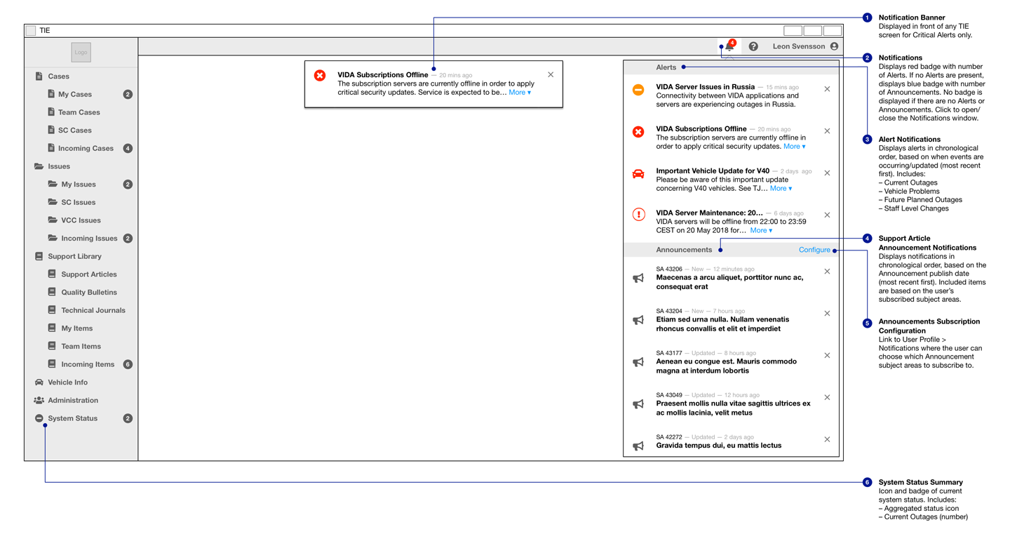
The visual design of the new app was therefore based on the Volvo global brand guidelines – taking its use of colour, typography, and logo placement as a starting point. The colour palette needed to be expanded to fulfil the much broader functionality that the app required, particularly for colour-coding status badges and other functional elements.
For 6 months, I worked on TIE with the existing product team – with zero developers. They then began hiring for a new team to build and maintain the new app in the long-term. Having established the value of user experience design within the team, I was then involved in hiring a permanent junior UX designer for the new team. During a further 2-month period, I handed over the design (including over 100 wireframe screens and a visual design framework) and worked with the new designer and developers to establish workflows and processes.
With the new designer, we fleshed out the screens from wireframes to visuals, building a design system in Sketch. These were then further prototyped, user-tested, and developed as the developers came on board. I then moved to another related team within Volvo to work on the VIDA application, which is the next project shown here.